Friday, May 28, 2010

SAS Designs Kit Release: "Rock Chick"

The newest release from SAS Designs blends black and fuschia in a textured, highly graphic collection titled "Rock Chick."  With a dozen papers and nearly 40 elements, this funky kit is sure to inspire your inner rockstar!  Perfect for teens and tweens, you can unleash this kit on concert pics, jam session snapshots or anything you want to give some urban flavor.  Check out what I did with it:

Rockin Out digital scrapbooking layout by Chanell Rigterink Credits Digital Kit: Rock Chick Kit by SAS Designs; Template: All the Space Templates by SAS Designs; Font: Century Gothic


Chillin' digital scrapbooking layout by Chanell Rigterink Credits Digital Kit: Rock Chick Kit by SAS Designs; Paper Tear: The Scrappin' Cop; Font: Grant's Ghosts

Thursday, May 27, 2010

Just a Taste...

I haven't posted here in a while, but I promise it's for a good reason...I've been working on my first Collection!  Finishing touches are in progress, but here's a little taste of what's to come:


Friday, May 14, 2010

SAS Designs Kit Release: "All About Me"

SAS Designs releases a new kit today called "All About Me." It's an adorable collection of 14 papers and more than 50 elements, including word art! While it's obviously intended for scrapping pages about ourselves, the springtime colors are also perfect for everyday pages. Here's what I created with the kit:


Boy Stuff digital scrapbooking layout by Chanell Rigterink Credits Digital Kit: All About Me Kit by SAS Designs; Stamp and Tag: For You Kit by SAS Designs; Font: Carbon Type

I'm also offering a free Quick Page using elements from the kit! You can really see its versatility here... Click the image to download. Enjoy!

Thursday, May 13, 2010

Hone Your Instincts: Using Sketches

There's been a lot of discussion lately on the forum at Scrapbook News and Review Magazine about using sketches. Do you like them...are they helpful...is it "cheating"...do you have to list them in the credits...

I, for one, love me some sketches. I find them to be wonderful springboards for my creativity, whether my interpretation of them is very literal or more abstract. When I don't have to spend so much time adjusting the placement of everything on the page (and sometimes starting over completely), the energy and stamina I have for the details are much greater. Plus, sketches keep me from sliding into same-ness; because left to my own devices, I tend to place things in very similar geography from one layout to the next.

For me, finding the perfect sketch that showcases the photos I want to use is just like finding the perfect embellishment or piece of paper. And no one ever accuses you of "cheating" if you don't make your own paper or use a store-bought flower instead of something you did yourself! Just like following a recipe or an architectural blueprint, a scrapbooking sketch is meant to take the guesswork out of the structural aspect of the process. And, just like a recipe or blueprint, they can be adapted as the circumstances change. Double it. Halve it. Stretch it out and turn it on its side. Replace areas intended for pictures with scraps of paper. Or go the other direction and add more photos to something that only shows one.

The key here is this...if you see a sketch and you like what it has to say, use it! The simple act of selecting your own papers and elements will make it yours. But, in the end, do be sure to credit the sketch artist. Many artists require credit in their Terms of Use, and even if they don't, it only seems polite to pass along their information for those who may see your page and like the layout as well!

Here are a few pages I've done, and the sketches that inspired them. First, a couple that stuck pretty closely to the original sketch:
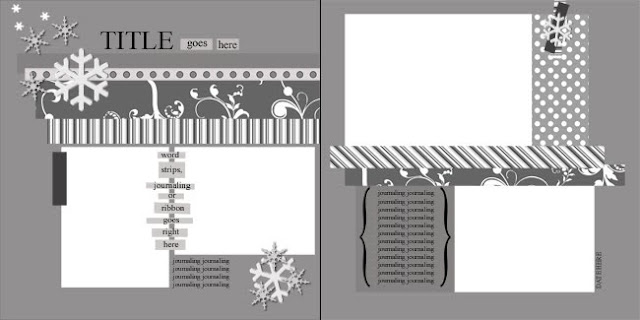

Sketch by Carey Bridges for Scrapbook News and Review Magazine
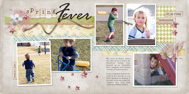
Spring Fever digital scrapbooking layout by Chanell Rigterink Credits Digital Kit: Simple Pleasures Kit by SAS Designs; Digital Kit: Vintage Nursery Collection by Keri Schueller; Alpha: Tiny Tatters by Marie Stones; Sketch by Carey Bridges for Scrapbook News and Review Magazine; Fonts: Cambria, Rage Italic

I made three very minor changes to the sketch in designing this page. 1. I slightly tilted one picture on the left page to bring more focus to it (it's my fav on the page!). 2. I divided the area on the right page that was intended for one large picture into two. This was based solely on how many pictures I wanted to include in the layout. 3. I carried the background strips of paper all the way across the page divide, rather than stopping a half inch or so before it cuts off. Again, this was totally a matter of taste, and I prefer that extra bit of cohesion between the pages. I used a similar treatment in the example below.


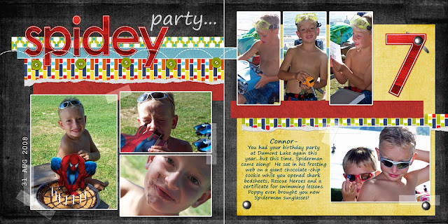
Spidey Party digital scrapbooking layout by Chanell Rigterink Credits Digital Kit: Splash of Color Collection by Angie Briggs; Red Paper: I Fish Collection by Theresa Kavouras; Paper Tears: Having Hope Collection by Thao Cosgrove; Sketch by Carey Bridges for Scrapbook News and Review Magazine; Fonts: Segoe Print, Courier New
Although this layout is based on the same sketch, by simply choosing different elements and colors, it takes on an entirely different personality than the previous example. Again, I made a few small adjustments to better suit my purposes in these pages. 1. I used a third picture on the left side instead of embellishments. 2. I broke up the same large picture on the right, but this time into three spots to accommodate a series of similar shots. 3. I replaced the small piece of patterned paper on the right page (represented in polka-dots on the sketch) with a larger, mat-like sheet of yellow paper. This brought extra color into a design that was starting to look too dark, and provided a much better backdrop for the journaling.
And, now, for an idea of how to use a sketch as inspiration, rather than a precise measurement:
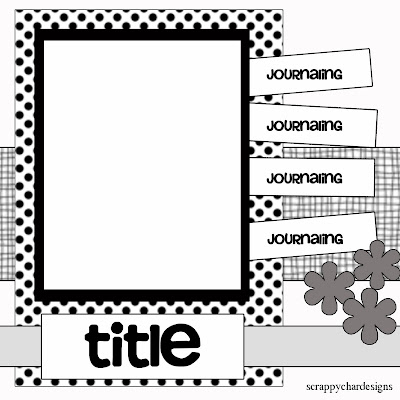
Sketch by Charlene Walberg for Scrapbook News and Review Magazine
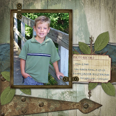
Six Years Old digital scrapbooking layout by Chanell Rigterink Credits Wood Paper: Following Love Kit by SAS Designs; Blue Paper: Water's Edge Collection by Angela Blanchard; Frame and Hinges: Mod Bungalow Collection by Brandy Hackman; Arrow, Compass, Leaves and Journal Spot: Rustique Collection by Kim Meeder; Crumple Paper and Paper Curls by Jan Hicks; Sketch by Charlene Walberg for Scrapbook News and Review Magazine; Font: Bradley Hand

A couple aspects of this sketch are readily identifiable in my page: namely, the placement of the photo and the horizontal piece of paper behind it. After that, I took some artistic license. I didn't want a large section of the wooden background to be covered, so I created the effect of paint strokes to more subtly create pattern and texture in its place. I used a single spot instead of multiple tags, and then decided on the large door hinge as a horizontal element to replace the title treatment in the sketch. So, while the result is not an element-for-element copy of the sketch, each piece is represented in the page and adapted to fit my needs.

So, that's the genius of using a sketch: complete personalization without the stress of determining structure. I think it's a sure-fire way to hone your creative instinct.

Monday, May 10, 2010

Happy (belated) Mother's Day

I'm not a new mom by any means; in fact, my baby will be three next month! But one of my favorite "mommy" quotes is about that mystical moment when your first child in born and your whole existance changes. So, to celebrate Mother's Day, I thought I'd make it into some free word art for you! And, since I haven't written TOUs yet, you can have it to use, no credit required.


P.S. I'm still figuring out 4Shared...the preview image is funky when you click over there, but I promise it downloads properly! Enjoy.

Saturday, May 8, 2010

In Honor of Tulip Time...

May in West Michigan means that (literally) thousands of tulips spring up for the celebration of Tulip Time. And, as it concludes this weekend, I found a little freebie for you to use with the myriad of pictures you took at the festival! These sketchy tulips are by Hero Arts Digital and available at Two Peas in a Bucket. The free download includes the full-color .png, plus a cute set of coordinated digital buttons.

If you're not a digi-scrapper, don't let it deter you from grabbing this great freebie. It can easily be printed and cut from cardstock, vellum, tissue or even fabric. Just imagine how these sweet tulips would be on your springtime layouts and cards!

Happy Scrapping!

Thursday, May 6, 2010

Shed the "Shoulds"

I'm what I like to call an "instinctive" scrapper. That is to say, I'm not a technique junkie. I don't have a particularly unique style; I'm certainly not an innovator. I just like what I like, pulling pieces of this style and that into my PSE melting pot. Very little of it is intentional...it's purely instinctive. And I'm okay with that. The fact is, I probably don't have much to say about scrapbooking that you haven't heard before...except, possibly, this:

You don't have to be technically savvy, unique or innovative to be a great scrapper.

Your pages don't have to look like the ones in the magazines. If you don't care for the current color trends or latest embellishment craze, it doesn't make you a bad person. Scrapbooking is a highly personal medium, subject to individual aesthetics. The most important criteria for creating a good page are these: 1. It should tell your story and 2. It should please your design sensibility. It should make you happy! And after that, it's just someone else's opinion.

There are blogs and dot-coms on every corner that want to help you scrap faster and better. I just want you to scrap like you.

So, what you'll find here is simply encouragement. Links to sites that I find inspiring. Maybe some broad-based tips. Certainly some freebies. Just general info that will support you in your creative process. Whether you're a paper-scrapper, digi or hybrid, I want to help you hone your instincts. My goal is for you to shed the "shoulds" and find the joy of scrapping by-the-seat-of-your-pants.