They're lovely. And they totally stump me! I get completely confused about how to use them! Where do I put the photos? Am I meant to cover some of the embellishment, or do I scrap on the opposite side?
So, over the course of time, I have forced myself to use some of these papers, and I've been really thrilled with what I've learned and how they have turned out. Let me share...
I love this paper from Tia Bennet's Springtime Fever Kit, and it seemed like it should be such a simple layout to complete. Just pop a photo on the obvious space for it, add a title and be done! But I was never happy with the outcome.
I eventually decided that I wanted the floral frame to overlay the photo...and since the frame was included as a separate element in the kit, I could do exactly that! I placed my picture, layered the frame over it, then sized it to precisely match the background. All the finishing details came together easily after that. I've posted this completed page before, but now you know "the rest of the story!"
Beautiful Life digital scrapbooking layout by Chanell Rigterink Credits Patterned Paper and Frame: Spring Time Fever Kit by Tia Bennett; Pink Paper, Flowers, Ribbon: Song of Spring Kit by SAS Designs; Paper Tear: Having Hope Collection by Thao Cosgrove; Word Art: Marie Stones; Font: Bodoni MT
I was intrigued when Angie Briggs released this freebie to coordinate with her Just B Messy Collection at ScrapGirls. It's so far outside my comfort zone, and yet I was really drawn to it. But I couldn't figure out the composition. If I covered up too much of the heart, I began to lose the sense of it's shape...and if I clustered small pictures together in the left upper corner, the page felt unbalanced.I finally stumbled upon the idea of layering this paper over a solid one, shrinking and tilting it slightly to better show off the torn edge. Suddenly, I had more room at the top, and a nice edge to anchor the pictures to. I ran some ribbons across the bottom to help ground the page and added an embellishment cluster that balanced the photos but didn't cover too much of the heart stamp.
On this Day digital scrapbooking page by Chanell Rigterink Credits Digital Paper: Just B Messy Collection by Angie Briggs; Embellishments: Splash of Color Collection by Angie Briggs; Staples: Valerie Randall; Font: Segoe Print
Both of those layouts were victories born of sheer persistence, but who doesn't prefer when a page just seems to design itself? That was the case here.
SPOILER ALERT: Here's a sneak peek at the August 2010 Freebie Template in Scrapbook News and Review Magazine! If you don't already have a subscription, get one today and check out hundreds more scrapbook pages, cards, mixed media projects and helpful articles!
 I contemplated this template for quite a while, waiting for inspiration to strike. I tried out several sets of pictures, dug through my stash looking for the right kit to use, and kept coming up empty.
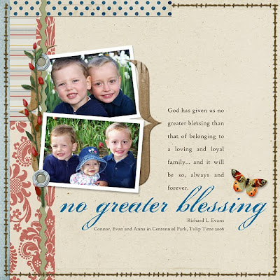
 Then, just before my deadline, Angie Briggs saved me with this freebie she released for her You Are Collection! I knew immediately what I wanted to do and which pictures to use...
 I gave the template a spin... and this beautiful paper that would have stumped me before springs to life with the pre-layered patterned papers supporting the ribbons and scallops intended in the template and the perimeter stitching mimicking the template border. Perfect!
No Greater Blessing digital scrapbooking layout by Chanell Rigterink Credits Digital Paper: You Are Collection by Angie Briggs; Embellishments: His and Hers Collection Biggie and Sweet-n-Sassy Collection by Angie Briggs; Template: SNR Free Template August 2010 by Missy Backues; Fonts: Porcelain, High Tower Text


Chanell - this is a fabulous article/review! I feel so inspired - I have to pull a few of these out from my stash.
ReplyDelete